The electricity market is a complex ecosystem influenced by dynamic interactions between supply, demand, and market forces. High-resolution data from platforms like SMARD, Germany’s leading electricity market platform, offers a rich tapestry of insights into actual and forecasted generation, consumption patterns, balancing reserves, and cross-border energy flows. By leveraging this comprehensive dataset, we can uncover nuanced trends and patterns that underpin electricity price fluctuations. The potential for advanced analytics and machine learning techniques to unlock predictive insights from such data is vast, promising not only to enhance market efficiency but also to inform strategic decision-making for energy traders, industrial consumers, and grid operators. This data-driven approach holds the key to optimizing operations, managing risk, and ultimately shaping the future of energy markets.
In this study, I conducted a comprehensive exploration of the data from multiple angles, performing an in-depth exploratory data analysis (EDA) to uncover potential trends and relationships. For the modeling phase, I employed rigorous feature engineering techniques to address missing values, transform and normalize features, and identify the most correlated variables. Notably, several key features exhibited significant missing values, prompting a detailed analysis and the application of simple models to impute these values using other features. Finally, I evaluated the performance of two ensemble models—Random Forest and XGBoost—on the preprocessed data and further enhanced their robustness and generalizability by integrating them into a simple aggregator model. The outline of this post is structured as follows:
- Data Overview
- EDA
- How do electricity prices fluctuate hourly, daily, and weekly across different countries?
- How do electricity consumption patterns change in the same timeframes, and how does this impact pricing?
- How does electricity generation (actual vs. forecast) align with price trends?
- What patterns emerge from scheduled commercial exchanges and cross-border physical flows?
- What features have the strongest correlation with electricity prices?
- How do electricity prices correlate between different countries?
- What is the relationship between forecasted vs. actual electricity generation and consumption?
- How do balancing reserves and TSO costs impact electricity prices?
- How do scheduled commercial exchanges influence price fluctuations?
- What is the impact of cross-border physical flows on electricity prices?

Data Overview
SMARD dataset includes 16 separate csv files that were recorded from January 2023 to March 2025. 3 of these files are recorded in yearly (Installed_generation_capacity, 3 samples), monthly (cost of TSO, 27 samples) and hourly (day ahead prices, 19056 samples) interval and the rest of them have quarter-hourly intervals (76224 samples). Day-ahead-Prices dataset contains the electricity price information of 17 countries including Germany itself, however DE/AT/LU [€/MWh] is completely missed and Northern Italy [€/MWh] has 8% missing values. These 16 dataset cover various themes including :
- Electricity Prices
- Cross-Border and commercial exchanges Electricity Flows: represents electricity flows between Germany and other countries. This includes both exports and imports of electricity for each country.
- Power Generation and consumption: Several generation sources including renewable energy sources (e.g., wind, solar, biomass) and conventional sources (e.g., nuclear, coal, gas)
- Balancing services information: track the activation and procurement of balancing services, which are used to maintain the stability of the electricity grid. Most features of balancing services are missed
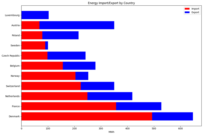
Figure 1 shows the mean amount of energy has exchanged between Germany and other countries. We can see that regardless of Luxembourg, Denmark with 493 [MWh] has the largest amount of import where Austria with 68 [MWh] has the least amount of import. Also, Sweden has the least amount of export with 10 [MWh] and Austria with 282 [MWh] has the most amount of export.
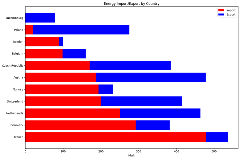
Figure 2 shows the mean amount of cross border flows of energy between Germany and other countries. We can see that regardless of Luxembourg, France with 477 [MWh] and Poland with 20 [MWh] has the largest and the lowest amount of import among all countries. Also, Sweden with 9 [MWh] and Austria with 289 [MWh] has the largest and the lowest amount of export respectively.
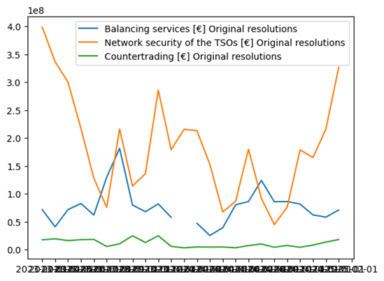
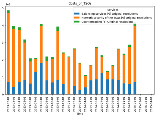
Figure 3 visualizes monthly costs incurred by Transmission System Operators (TSOs) for maintaining grid stability, including balancing services, network security, and countertrading activities. looking at the images, network security has the greatest cost and countertrading activities has the lowest cost. Also, network security Cost shows a very volatile behavior with dramatic rises and falls, where countertrading activities cost remains relatively steady over time.
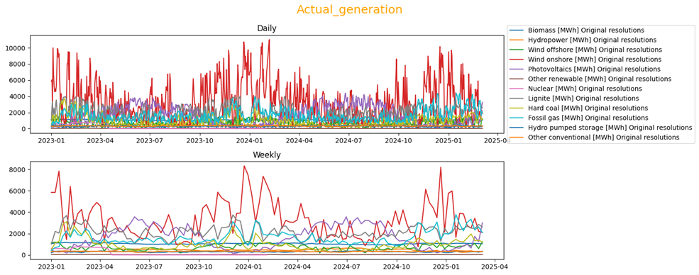
Figure 4 compares the amount of energy that has generated by different generation sources in two time-frames, daily and weekly. Wind onshore (red line) is the main source for generating electricity with the highest generating value in most of the time. After that, Photovoltaics(purple line) fossil gas (cyan line) and Lignite (gray line) are highly used in Germany for generating.
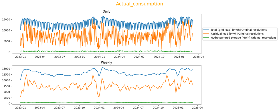
Figure 5 represents the amount of energy consumption for three features in two time-frames, daily and weekly. Mean of Total consumption is around 14000 [MWh] pre day with a repetitive and constant pattern of rises and falls which is probably indicates days and nights. However residual load (Indicates how much non-renewable energy is required to meet demand after accounting for renewables.) is more volatile.
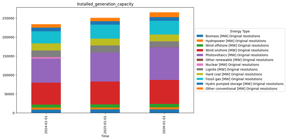
Installed generation Capacity dataset has three samples and is recorded once a year. Based on Figure 6, there is a slight rise in generation capacity of different sources year to year and that could be due to the increasing of demands in each year. The generation capacity of each source coincides with the generation of each source which was shown in figure 4.
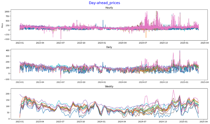
Figure 7 represents the trend of electricity price in different countries. Prices fluctuate significantly, with values ranging from €0/MWh to €400/MWh. This indicates high volatility in daily electricity prices. Peaks and troughs are visible, suggesting occasional price spikes, possibly due to demand surges, supply shortages, or geopolitical events. The general pattern suggests similar fluctuations across countries. Electricity prices are strongly influenced by seasonal demand, with winter months exhibiting the highest prices.
EDA
How do electricity prices fluctuate hourly, daily, and weekly across different countries?
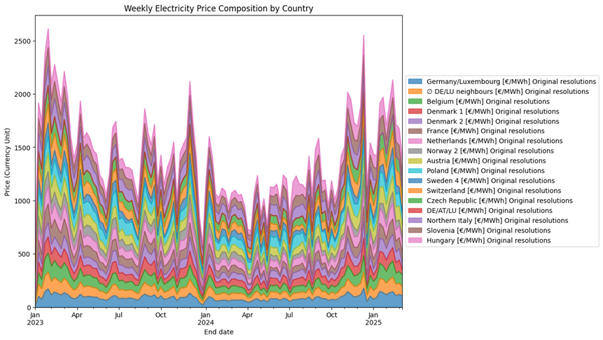
Figure 8 depicts weekly electricity prices across 16 European countries. Each country’s price data is represented in a stacked area format, highlighting the composition and fluctuations over time.
- Prices show significant volatility, with peaks occurring at regular intervals, particularly during winter months (e.g., January 2024 and January 2025).
- Germany/Luxembourg and other neighboring countries appear to contribute consistently to the overall price composition.
- Countries like Norway, Austria, and Hungary display relatively smaller contributions compared to others.
- Seasonal trends are evident, with higher prices during colder months likely due to increased energy demand for heating.
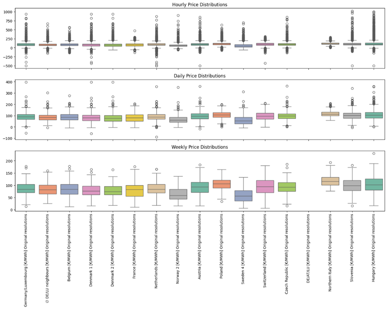
The boxplots in Figure 9 illustrate electricity price distributions across 16 countries at hourly, daily, and weekly timeframes.
- Hourly Price Distributions:
- High variability is evident, with numerous outliers above and below the interquartile range.
- Prices fluctuate significantly within short timeframes, indicating potential volatility in hourly electricity markets.
- Daily Price Distributions:
- Variability decreases compared to hourly data, but outliers persist.
- Daily averages smooth out some fluctuations, providing a clearer picture of trends compared to hourly data.
- Weekly Price Distributions:
- Weekly data shows even less variability, with fewer extreme outliers.
- Aggregating over a week offers a more stable view of electricity prices, useful for longer-term planning.
How do electricity consumption patterns change in the same timeframes, and how does this impact pricing?
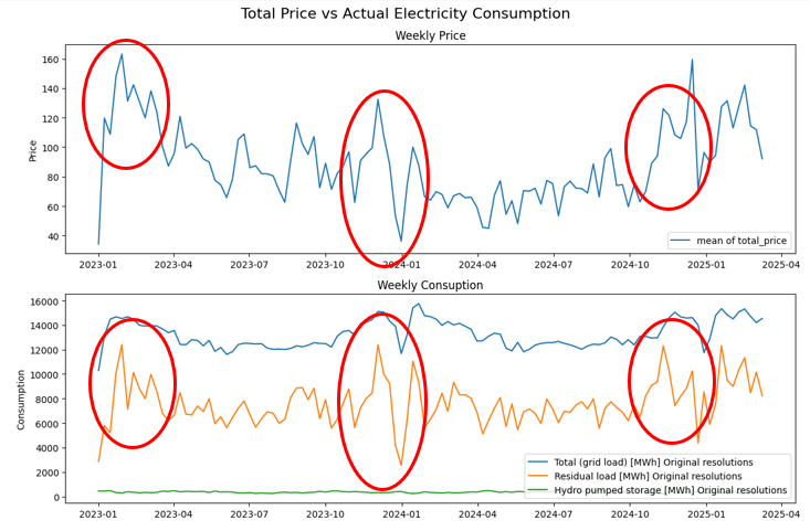
Figure 10 focusing on the trends of weekly electricity consumption and the mean weekly total electricity price in 16 European countries.
- Total grid load (electricity consumption) shows a relatively stable pattern compared to price. There are slight dips in total grid load during the summer months.
- Residual load (the load remaining after accounting for renewable sources) fluctuates more significantly, showing some peaks aligning with price peaks. This suggests the type of electricity source fulfilling the demand plays a crucial role in pricing.
- Hydro pumped storage consumption remains relatively low and stable
- Electricity prices are strongly influenced by seasonal demand, with winter months exhibiting the highest prices.
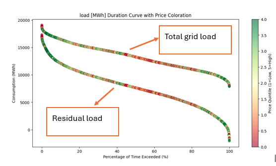
Figure 11 shows the duration curve of electricity consumption (total grid load and residual load) vs electricity price. The x-axis represents the percentage of time a certain consumption level is exceeded. The y-axis represents the consumption level in MWh. The color of the data points indicates the electricity price quintile (from low to high).
Total Grid Load Curve
- Represents the overall electricity demand
- The curve slopes downwards, indicating that higher consumption levels are exceeded for a smaller percentage of the time.
- The coloration shows that both low and high price quintiles occur across the range of total grid load. High prices tend to be more frequent at the lower durations.
Residual Load Curve
- The curve is below the total grid load curve, as it represents a portion of the total demand.
- The coloration shows a similar trend to the total grid load, with price quintiles scattered along the curve.
Price vs load
- High price quintiles (redder colors) appear at both ends of the duration curves (low and high durations). This means high prices occur during both peak demand periods (low duration for total grid load) and during periods when the residual load is high for a relatively short time.
- Lower price quintiles (greener colors) tend to be more frequent during periods of moderate consumption levels (middle of the curves).
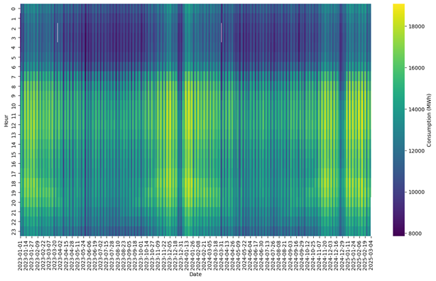
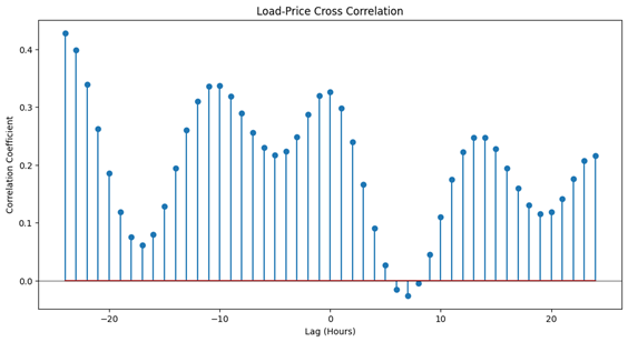
Figure 12 represents the amount of electricity consumption over time. Top figure displays electricity consumption (in MWh) over time, with the x-axis representing the date (from January 2023 to March 2025) and the y-axis representing the hour of the day (0-23). Warmer colors (yellow/green) indicate higher electricity consumption, while cooler colors (purple/blue) indicate lower consumption. bottom figure shows the cross correlation of electricity consumption in 48 hours (lags) from -24 to 25.
- Daily Pattern: A clear daily cycle is visible. Consumption is generally lower during the nighttime hours (approximately 0:00 to 6:00) and higher during the daytime hours (approximately 8:00 to 22:00).
- Morning Peak: A sharp increase in consumption is evident in the morning hours as activity starts.
- Evening Peak: A more gradual decline in consumption occurs after the evening peak.
- Seasonal Variation: Consumption tends to be higher during the winter months (late 2023, early 2024, late 2024, early 2025) compared to the summer months. This is likely due to increased heating and lighting needs.
Low Consumption Periods: Some days show exceptionally low consumption throughout the entire day, likely corresponding to holidays or weekends. These are visible as vertical darker lines
How does electricity generation (actual vs. forecast) align with price trends?
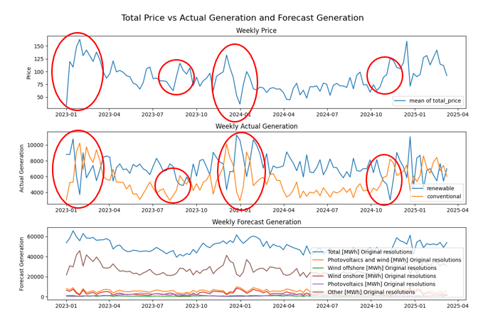
Looking at Figure 13, its evident that:
- Conventional Sources Influence Prices: The red circles highlight instances where generation from conventional sources significantly impacts total electricity prices. This is likely due to the higher financial costs associated with these sources.
- Opposite Trends in Generation: In most cases, the generation trends of renewable and conventional sources are inversely related. This suggests a complementary relationship between the two.
- Renewables Meet Demand in Favorable Conditions: During sunny or windy days, renewable sources (e.g., solar, wind) generate sufficient electricity to meet demand, reducing reliance on conventional sources and leading to lower prices.
- Conventional Sources Compensate in Unfavorable Conditions: When environmental conditions are unsuitable for renewable generation (e.g., cloudy or calm days), conventional sources are used, driving up costs and resulting in higher electricity prices.
- Price Sensitivity to Generation Mix: The price fluctuations reflect the sensitivity of electricity costs to the balance between renewable and conventional generation, with renewables generally contributing to lower prices when available.
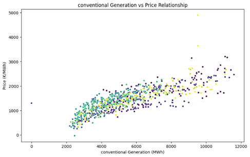
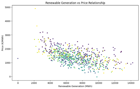
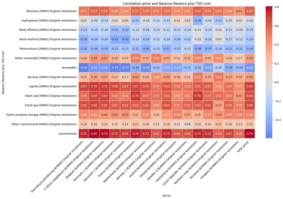
Figure 14 represents the correlation between Electricity price and renewable/conventional Generation and Figure 15 shows the Pearson correlation between electricity price in different countries and electricity generation sources. Based on this image:
- Conventional Sources and Price: Strong positive correlations exist between electricity prices and conventional sources like lignite, hard coal, and fossil gas across many countries. This suggests that higher generation from these sources is associated with higher prices, potentially due to fuel costs and carbon pricing.
- Renewables and Price: Renewable sources (aggregated) generally show a negative correlation with price. This implies that increased renewable generation tends to lower electricity prices, which is expected. However, the correlation varies across countries.
- Country Variations: Correlation patterns differ significantly between countries. For example, Germany/Luxembourg exhibits a strong positive correlation between conventional sources (lignite, hard coal, fossil gas) and electricity prices (0.67, 0.56, 0.65 respectively), suggesting that these sources are significant price drivers in that region, likely due to carbon costs and fuel expenses; this trend is echoed in other countries like Belgium and France. In contrast, the impact of “Other renewable” varies, showing a positive correlation in some countries like the Netherlands (0.50) and a weaker or even negative correlation elsewhere, highlighting differences in renewable energy integration strategies and resource availability across the European landscape. These variations are likely influenced by a combination of factors including the dominant energy mix, market regulations, grid infrastructure, and the prevalence of specific renewable technologies within each country.
- Lignite Correlation: Lignite shows a particularly strong positive correlation with price in several countries, potentially reflecting its high carbon intensity and associated costs.
What patterns emerge from scheduled commercial exchanges and cross-border physical flows?
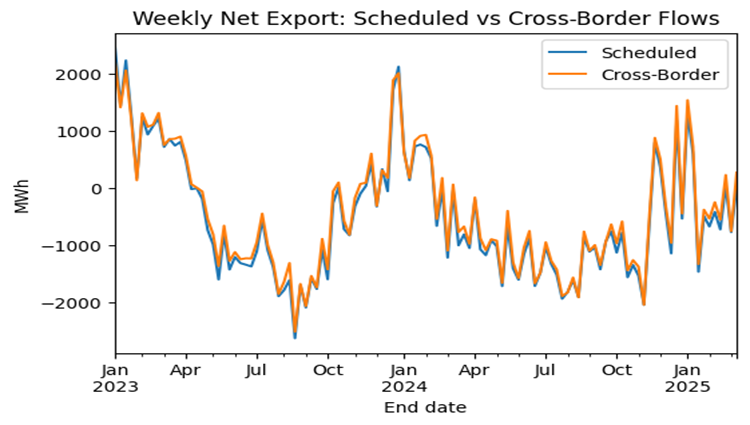
Figure 16 reveals a strong correlation between scheduled commercial electricity exchange and actual cross-border physical flows, with the two lines closely mirroring each other over the period from January 2023 to March 2025; This indicates a well-functioning market where planned transactions are generally realized in practice, although some discrepancies exist, suggesting potential grid congestion, transmission losses, or adjustments made in real-time to maintain grid stability.
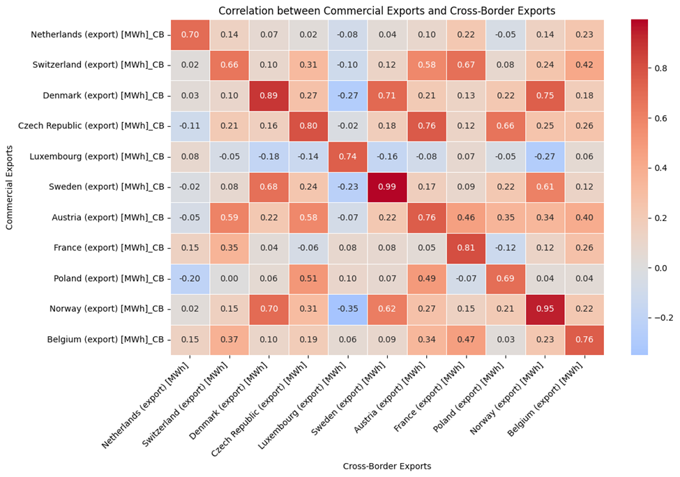
Figure 17 show correlation between cross-border physical flows of electricity and scheduled commercial exchange of electricity of 16 countries
- Diagonal Dominance: The diagonal elements (e.g., Netherlands-Netherlands) show high positive correlations. This is expected, as it represents the correlation between commercial and cross-border exports within the same country. Values range from around 0.66 to 0.99.
- Sweden: Sweden exhibits a near-perfect correlation (0.99) between its commercial and cross-border exports. This suggests a very strong alignment between scheduled commercial activity and actual physical flows across its borders.
- Norway: Norway also shows a very high correlation (0.95) between commercial and cross-border exports.
- Denmark: Denmark exhibits a very high correlation (0.89) between its commercial and cross-border exports.
- Czech Republic : Czech Republic exhibits a very high correlation (0.80) between its commercial and cross-border exports.
- Negative Correlations: Some country pairs exhibit negative correlations (indicated by blue). This suggests that when one country’s commercial exports are high, the other country’s cross-border exports tend to be low, or vice versa. These negative correlations are generally weaker than the positive correlations
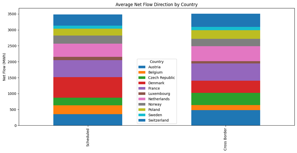
Analysis of the average net export data in Figure 18 reveals the average net flow direction per country, comparing scheduled versus cross-border physical flows. Austria and France stand out as leading net exporters, exhibiting substantial positive net flows in both scheduled and cross-border exchanges. Czech Republic and Denmark are also significant net exporters. The consistency between scheduled and cross-border net flows for these leading countries suggests well-aligned market operations and efficient use of cross-border transmission capacity.
What features have the strongest correlation with electricity prices?
Features in Figure 19 turned out to be the most correlated features with prices in different countries. These are filtered features with the correlation higher than 0.5 or less than -0.5 with different prices
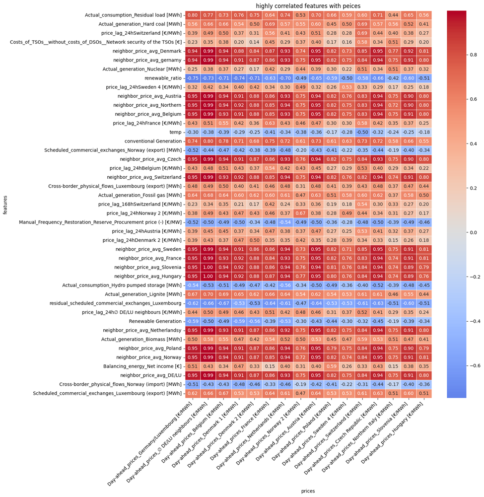
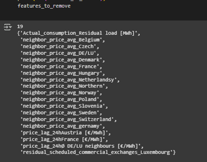
These features are the union of correlated features with each country’s electricity price. As it can be seen and expected, neighbor_price_average features which were created based on the mean of electricity price of each country’s neighbors are highly correlated with the price. However, some of them are highly correlated with each other and must be removed before feeding into model. Figure 20 shows the list of 19 highly cross-correlated features(abs(corr)>0.9) that must be removed.
How do electricity prices correlate between different countries?
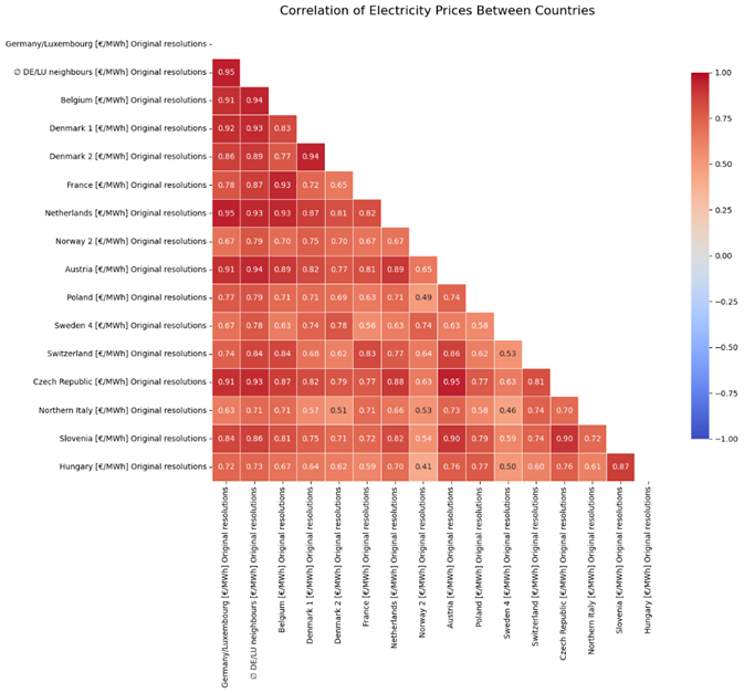
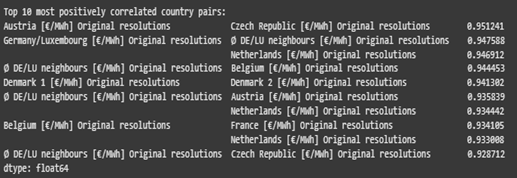
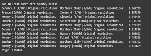
Figure 21 demonstrates the correlation between electricity price in different countries. The electricity price in most of countries are highly correlated with each other and more than 96% of them are correlated with each other more than 0.50. Figure 22 represents the 10 most and least pair correlated countries. Denmark, Italy, Sweden, Slovenia, Switzerland, Poland and Hungary are among the countries that have the least correlation with each other (ranges from 0.41 to 0.56 ) and Austria, Germany, Belgium, Czech Republic, Netherland and France are among the countries that have the most correlation in electricity price with each other. (more than 0.92)
What is the relationship between forecasted vs. actual electricity generation and consumption?
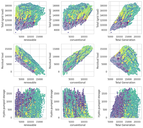
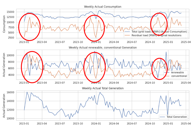
Figure 23 illustrates the relationship between electricity generation and consumption in respect of their movement over time and the scatter plot. the movement plot showcasing a balanced system where production aligns with demand. Total consumption remains stable but exhibits seasonal peaks, while renewable generation steadily increases, reducing reliance on conventional sources. The residual load, representing unmet demand by renewables, fluctuates significantly, reflecting the variable nature of renewable energy. Overall, the graphs demonstrate a shift toward sustainability, with renewables playing an increasingly dominant role in meeting consumption needs and adapting to seasonal and external influences. Similarly, As it can be seen from the scatter plot, Total generation are positively correlated with total grid load (higher demand higher supply) and residual load also have a clear positive and negative correlation with both conventional and renewable sources respectively.
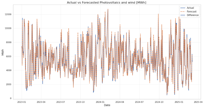
Photovoltaics and Wind [MWh] Error Metrics:
- MAE : 281.41
- RMSE: 429.34
- Correlation: 0.99
- Bias :18.97
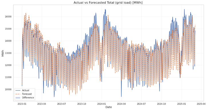
Total (grid load) [MWh] and Residual load Error Metrics:
- MAE : 484.52
- RMSE: 613.07
- Correlation: 0.96
- Bias :-39.67
Total (grid load) [MWh] Forecast Error Metrics:
- MAE : 484.52
- RMSE: 613.07
- Correlation: 0.96
- Bias :-39.67
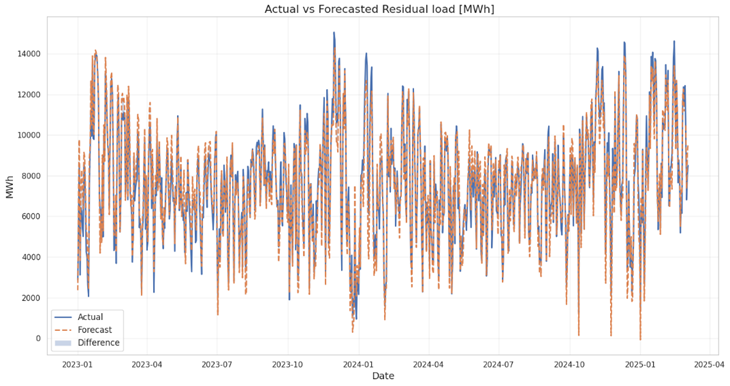
Residual Load [MWh] Forecast Error Metrics:
- MAE : 645.29
- RMSE: 833.38
- Correlation: 0.97
- Bias :-44.34
Figure 24, 25 and 26 compares actual and forecasted values of different sources of energy generation and consumption, measured in megawatt-hours (MWh).
Photovoltaics and wind [MWh]:
- The close alignment between actual and forecasted values, along with a high correlation coefficient (0.9921), indicates strong predictive accuracy.
- Error metrics reveal discrepancies: MAE of 281.42 MWh and RMSE of 429.35 MWh suggest moderate deviations between actual and predicted values.
- The bias metric of 18.98 MWh highlights a slight tendency for over- or under-prediction.
- Infinite MAPE likely arises from division by zero when actual values are very small or zero.
- Overall, forecasts show high correlation with actual data but occasional deviations occur, especially during periods of higher variability in generation.
Total (grid load) [MWh]:
- The plot shows a strong overlap between the actual and forecasted total grid load, indicating a good model fit. The forecast captures the overall trend and seasonality effectively.
- MAE (484.52 MWh): The average absolute error between forecast and actual is relatively low.
- RMSE (613.07 MWh): The RMSE, being slightly higher than the MAE, suggests that there are some larger errors present, but not excessively so.
- MAPE (3.71 %): The low MAPE indicates excellent percentage accuracy.
- Correlation (0.9648): High correlation confirms a strong linear relationship between the forecast and actual values.
- Bias (-39.67 MWh): A negative bias suggests a slight tendency to over-forecast (predict higher values than actual).
Residual load [MWh]:
- While the forecast generally follows the actual residual load, there’s more visual deviation compared to the total grid load forecast. The model appears to struggle more with capturing the peaks and troughs of the residual load.
- MAE (645.29 MWh): The average absolute error is higher than that of the total grid load.
- RMSE (833.39 MWh): The RMSE is also considerably higher, indicating larger errors and potentially more outliers or unpredictable fluctuations in the residual load.
- MAPE (35.43 %): The MAPE is significantly higher, showing lower percentage accuracy.
- Correlation (0.9707): The correlation is still high, indicating a strong linear relationship, but slightly less accurate than for total load.
- Bias (-44.34 MWh): The negative bias suggests a tendency to over-forecast (predict higher values than actual). The bias is similar to the Total load forecast.
How do balancing reserves and TSO costs impact electricity prices?
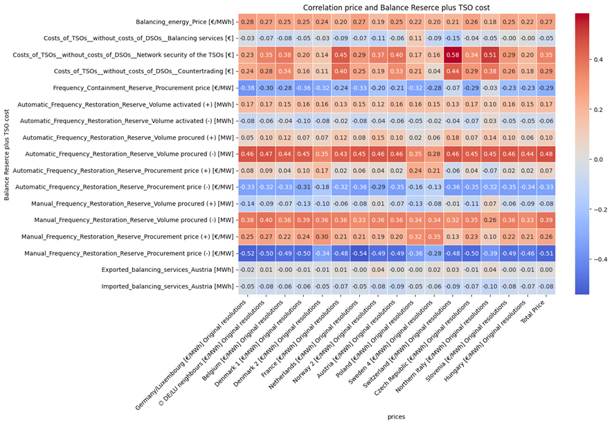
Figure 27 shows correlation between balancing reserves and TSO costs with electricity prices of different country. Based on the figure following insights are obtained:
- The Network Security Costs of the TSOs (Costs_of_TSOs_without_costs_of_ DSOs_Network security of the TSOs [€]) shows the highest correlation (0.58) with electricity prices. This suggests that when network security costs increase, electricity prices tend to rise significantly.
- Automatic Frequency Restoration Reserve Volume procured (+) [MW] (0.47, 0.44, 0.45) correlates moderately with prices.
- Balancing energy price [€/MWh] (0.28 – 0.27) shows a moderate positive correlation with electricity prices.
- Manual Frequency Restoration Reserve Volume procured (+) [MW] (0.38 – 0.40) indicates that higher procurement of manual reserves leads to higher prices.
- Manual Frequency Restoration Reserve Procurement Price (-) [€/MW] (-0.52 to -0.49) has the strongest inverse relationship with electricity prices. This implies that when the price for procuring manual frequency restoration reserves decreases, electricity prices tend to go up.
- Automatic Frequency Restoration Reserve Procurement Price (-) [€/MW] (-0.35 to -0.33) suggests that lower procurement prices for automatic reserves are linked with higher electricity prices.
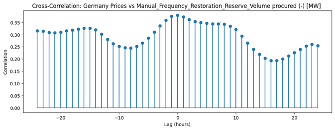
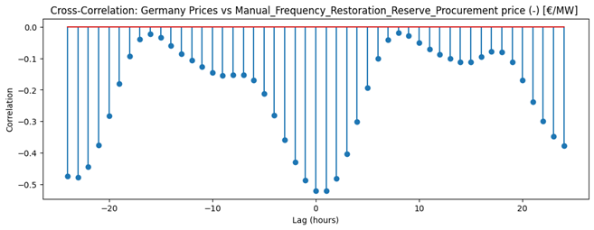
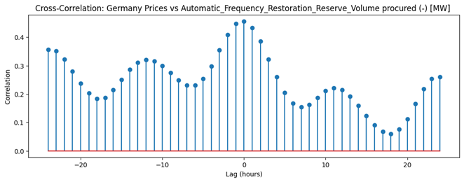
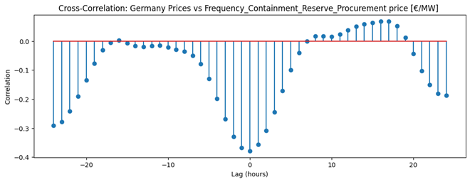
Figure 28 shows the correlation between the most correlated balancing reserves with Germany electricity prices in different time lags. Based on these images:
- Frequency Containment Reserve Procurement Price vs. Germany Prices
The cross-correlation plot shows a strong negative correlation at lag 0, indicating that increases in Frequency Containment Reserve (FCR) procurement prices are associated with immediate decreases in electricity prices. The correlation is most negative at zero lag and remains negative for several hours before and after, suggesting a contemporaneous and slightly persistent inverse relationship between FCR procurement costs and market prices. - Automatic Frequency Restoration Reserve Volume Procured vs. Germany Prices
This plot reveals a positive correlation peaking at zero lag, meaning higher volumes of Automatic Frequency Restoration Reserve (aFRR) procured are associated with higher electricity prices at the same time. The correlation remains positive across all lags, though it oscillates, indicating a generally direct and somewhat cyclical relationship between aFRR volume and electricity prices. - Manual Frequency Restoration Reserve Procurement Price vs. Germany Prices
Here, the cross-correlation is strongly negative at lag 0, with the lowest point at zero lag, signifying that higher Manual Frequency Restoration Reserve (mFRR) procurement prices coincide with lower electricity prices. The negative correlation is broad and persistent across a wide range of lags, highlighting a robust inverse relationship between mFRR procurement costs and electricity prices. - Manual Frequency Restoration Reserve Volume Procured vs. Germany Prices
This plot shows a consistently positive correlation, peaking around zero lag, indicating that higher volumes of mFRR procured are associated with higher electricity prices. The correlation remains positive and relatively stable across all lags, suggesting a sustained direct relationship between the volume of mFRR procured and electricity prices.
How do scheduled commercial exchanges influence price fluctuations?
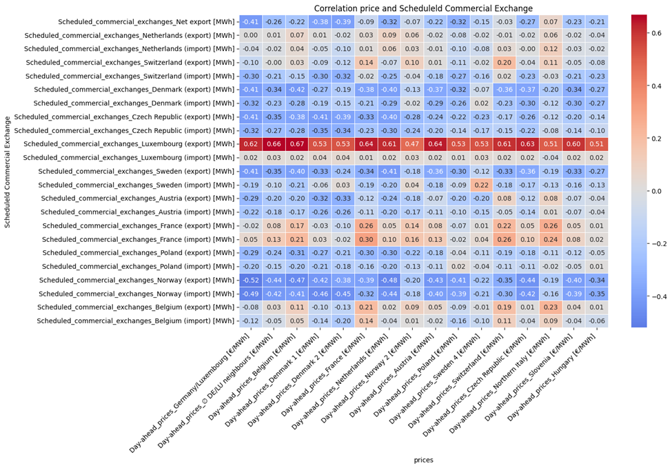
Figure 29 show the correlation between schedule commercial electricity exchange (import and export) and electricity price of different countries.
- Scheduled commercial exchanges with Luxembourg (import) [MWh] have the strongest positive correlation (0.62 – 0.67) with electricity prices in different regions, especially in Luxembourg. This means that when Luxembourg imports electricity, prices tend to rise, which could indicate that higher demand from Luxembourg leads to an increase in electricity prices.
- Scheduled commercial exchanges with Norway (especially imports, e.g., Norway import [MWh]) show strong negative correlations (-0.49 to -0.45).
- Similarly, scheduled commercial exchanges with Sweden show negative correlations (-0.19 to -0.40), especially exports. These negative correlations suggest that when electricity is imported from these countries, prices tend to decrease.
- Imports from Poland show a negative correlation with prices (-0.40 to -0.43), suggesting that an increase in imports from Poland tends to lower prices in the region.
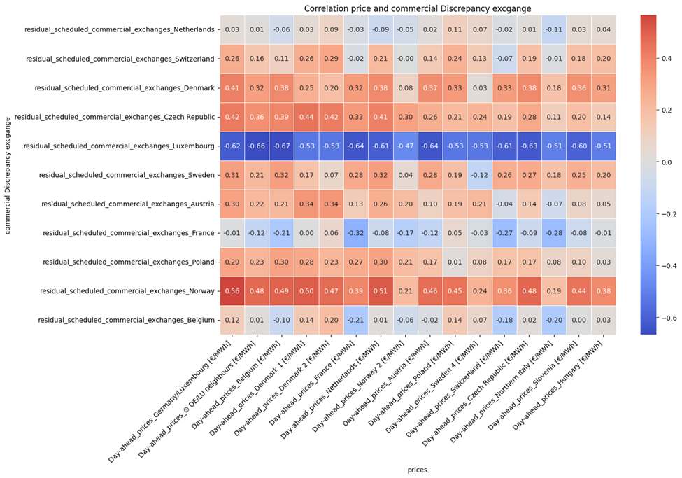
Figure 30 show the correlation between electricity prices and commercial Discrepancy exchange (export minus import). here are the insights :
- Norway’s net export has the strongest impact in increasing prices.
- Luxembourg’s net export is the most influential in reducing prices.
- Countries like Denmark, Czech Republic, Sweden, and Austria also show a price-increasing trend with higher exports.
- The overall trend suggests that net exports generally lead to higher prices, except in cases like Luxembourg where exports lower prices.
What is the impact of cross-border physical flows on electricity prices?
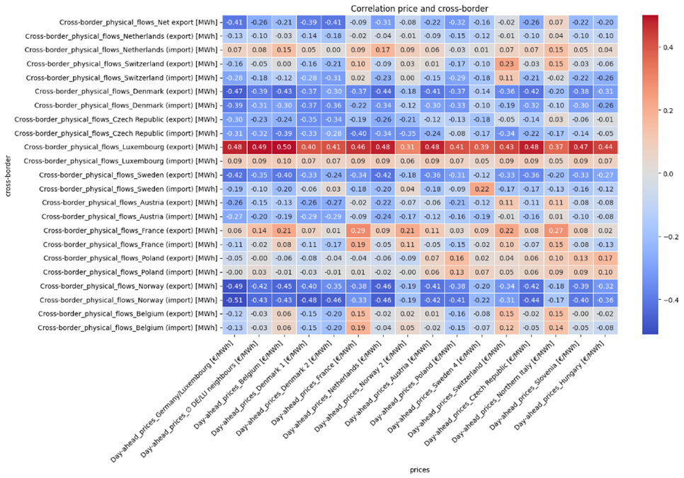
Figure 31 show the correlation between physical cross border flows (import and export) and electricity price of different countries.
- Most correlations between import flows and electricity prices (especially with countries like Belgium, Norway, and Luxembourg) are negative. This suggests that increased electricity imports tend to lower the price of electricity in the importing country.
- On the other hand, countries with high export correlations like Luxembourg (export) and Czech Republic (export) show positive correlations with electricity prices. This indicates that exporting electricity might lead to higher domestic electricity prices, possibly due to reduced supply.
- Sweden and Austria show mixed results for imports and exports, with some correlations being close to zero or slightly negative. This could suggest that their cross-border electricity trade might not have as strong an influence on their domestic prices.
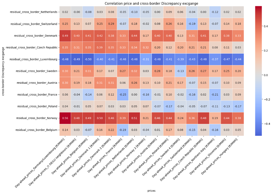
Figure 32 show the correlation between physical cross border flows discrepancy (export minus import) and electricity price of different countries.
- Norway shows the strongest positive correlation (0.51 to 0.56) with the electricity prices in various countries. This suggests that when Norway has higher discrepancies (exports exceeding imports), it tends to correlate with higher electricity prices in those countries.
- Luxembourg shows a consistently strong negative correlation (ranging from -0.41 to -0.50). This means that when Luxembourg experiences higher discrepancies in exports versus imports, it correlates with lower electricity prices in Luxembourg.
- For countries like Austria, France, Poland, and Belgium, the discrepancy between export and import flows has little to no significant effect on electricity prices.
- Exports exceeding imports (higher discrepancy) generally increase electricity prices in countries like Norway, Denmark, and Czech Republic, likely due to a decrease in the local supply.
- Exports exceeding imports in Luxembourg have the opposite effect, lowering electricity prices.
It’s enough for this article , Feature Engineering and modelling parts are in the next post.